レグザ視聴データソリューション
 お問い合わせ
お問い合わせ
お問い合わせ
Key Features of the Package (focus: adult-oriented anime)
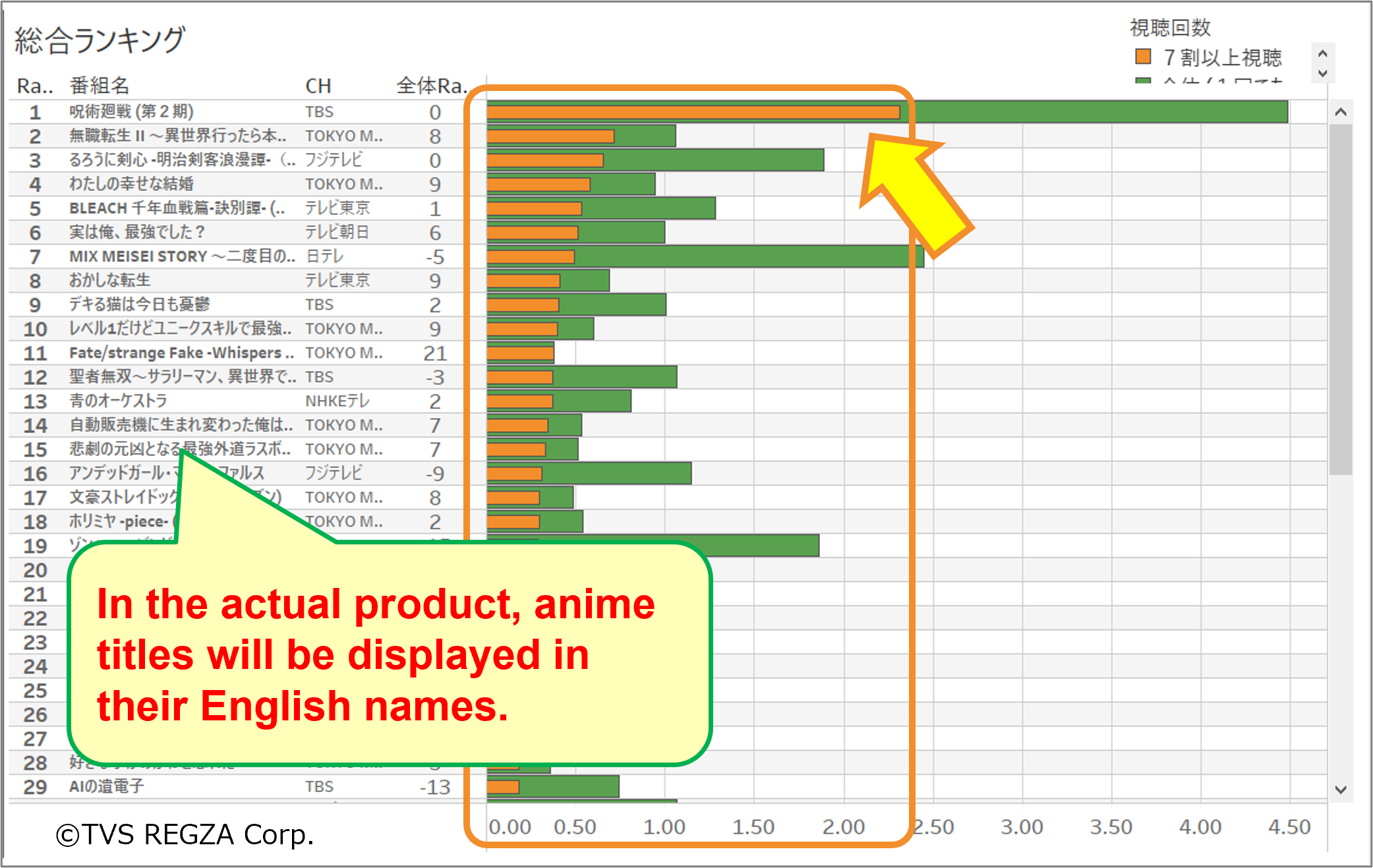
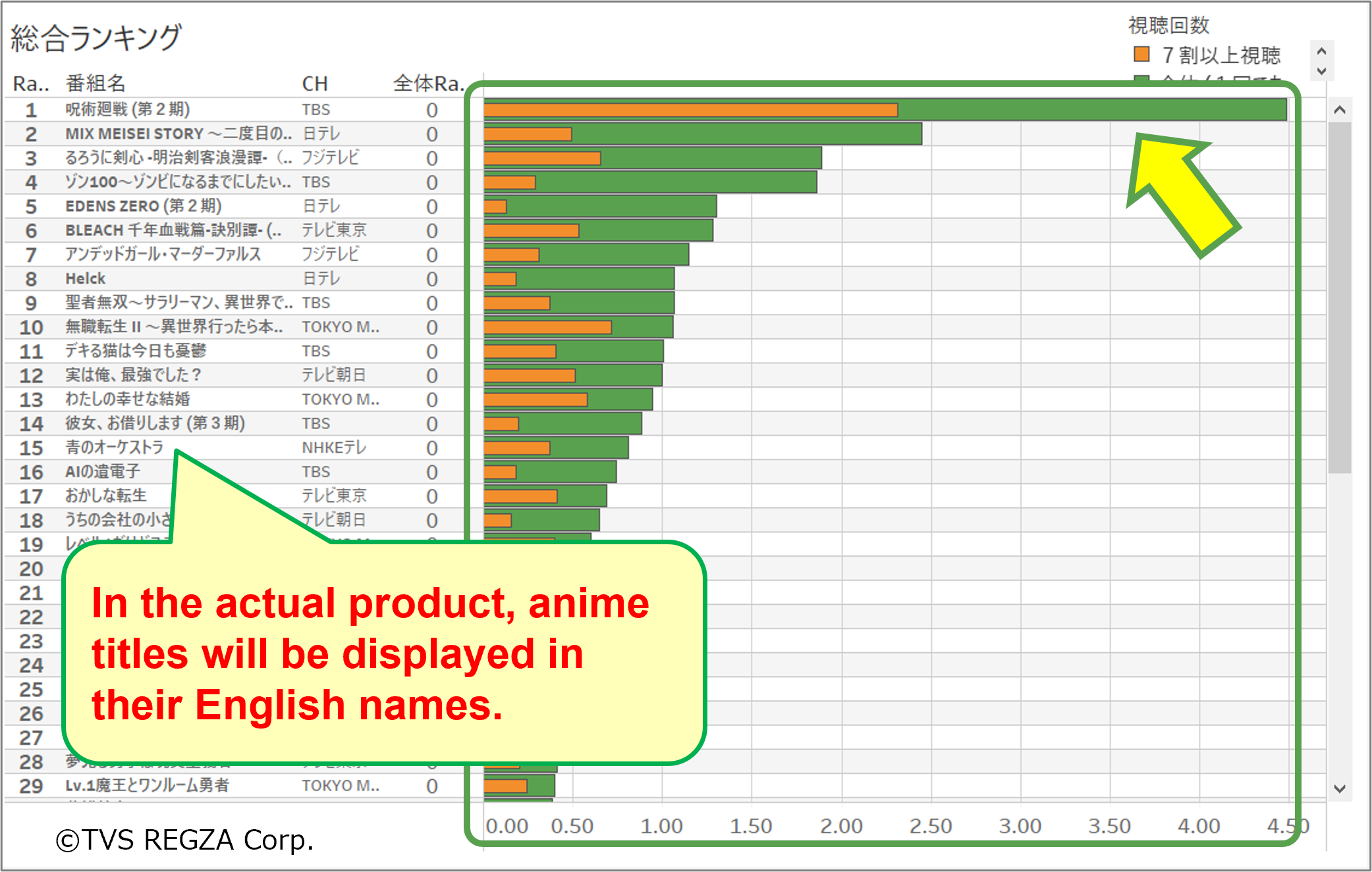
1. Comparability
Unlike streaming-exclusive shows, this data aligns major anime series side-by-side for apples-to-apples comparisons.
2. Precision Viewing Data
Instead of memory-based online surveys, this provides precise viewing data measured in seconds.
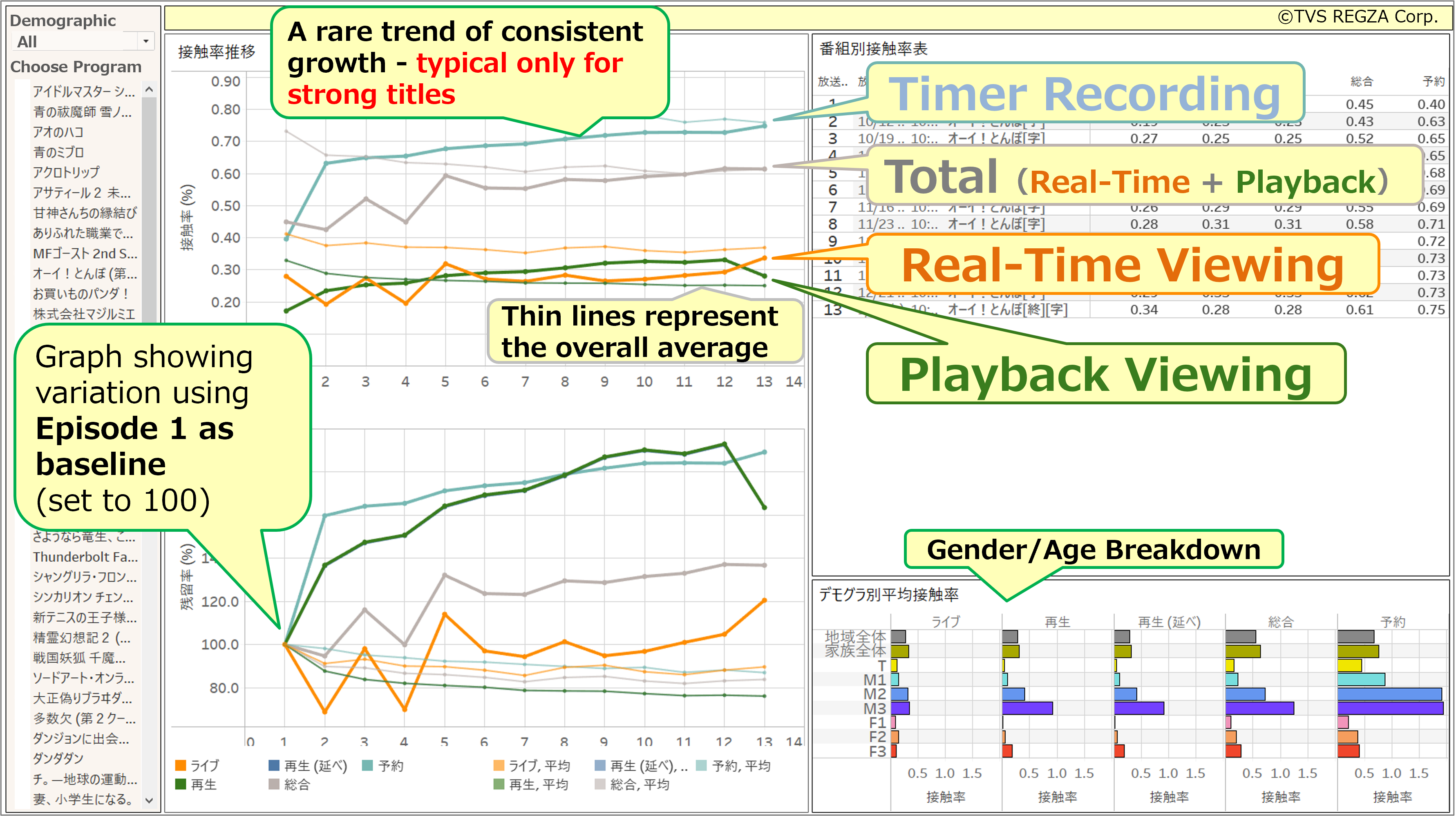
3. Multi-Source Viewing Modes
Real-time viewing, playback of recordings, and timer recording can all be compared and analyzed from a single data source.
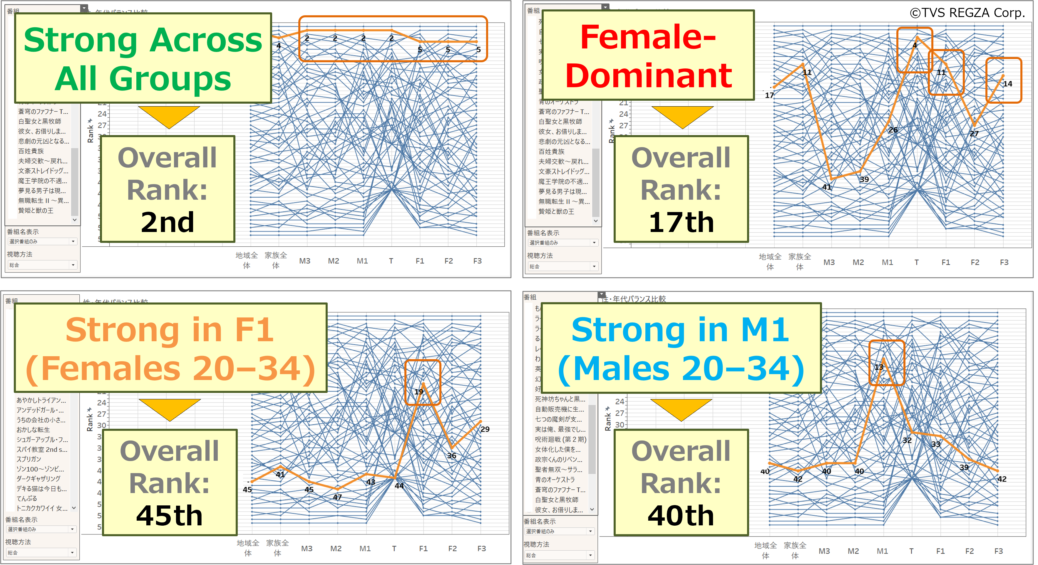
4. Demographic Reception Analysis
Viewer acceptance can be compared by gender and age group (Teen, M1, M2, M3, F1, F2, F3*, and region-wide data).
*M = Male, F = Female, 1 = age 20 to 34, 2 = age 35 to 49, 3 = age 50 to 74
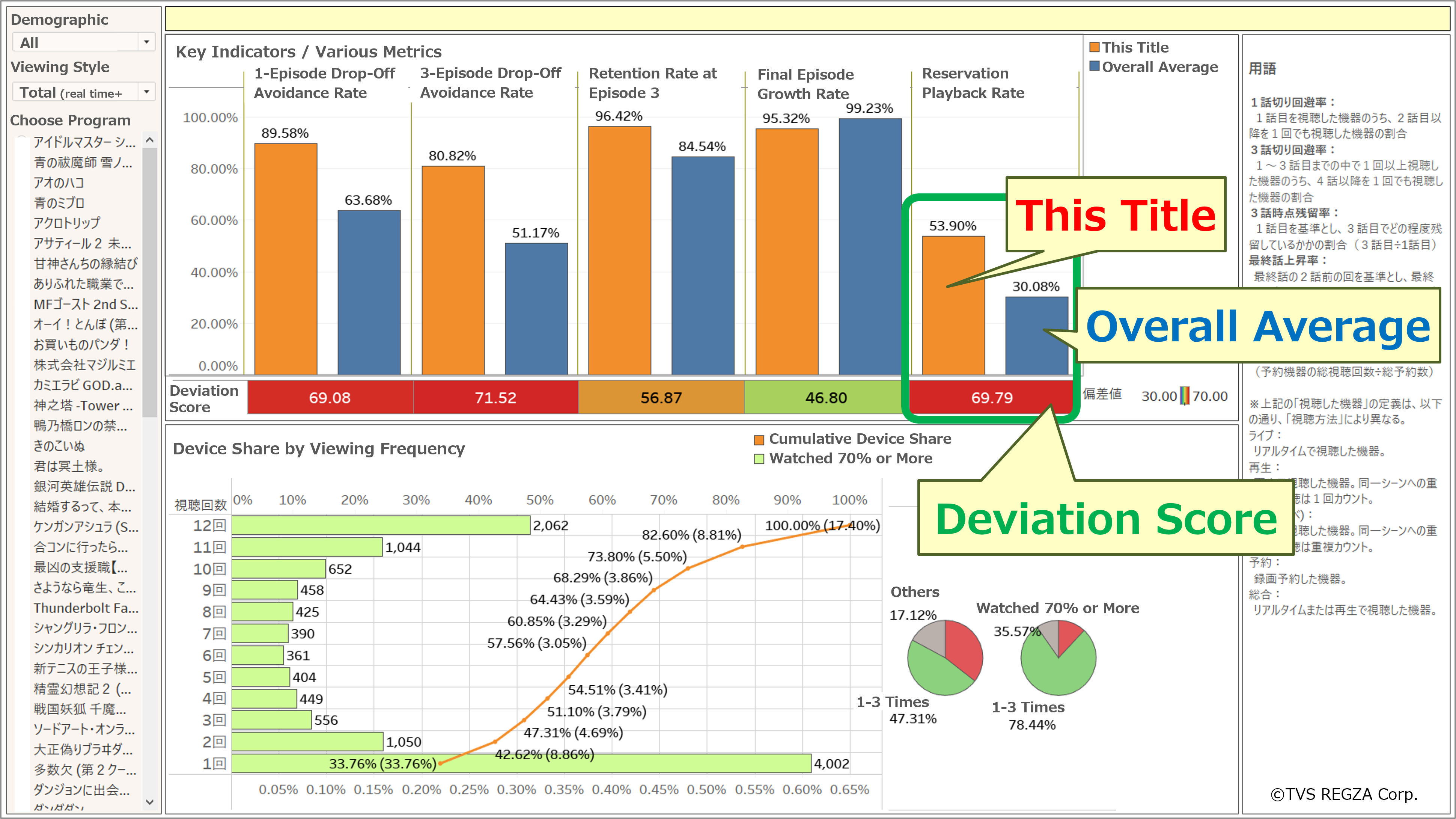
5. Episode-Level Trends
Fluctuations by episode (broadcast slot) and the exclusion of numerical drops caused by special programs or recap episodes are implemented, making it possible to compare the true strength of each series.
6. Large Sample Size in Kanto Region
Approximately 670,000 samples from the Kanto region (Tokyo, Kanagawa, and Saitama, including TOKYO MX coverage) enable not only tracking viewership trends per episode, but also analysis and comparison of viewers who watched a whole cour.
*Viewers who watched at least 70% of episodes (e.g., 9 out of 12 episodes) are counted.
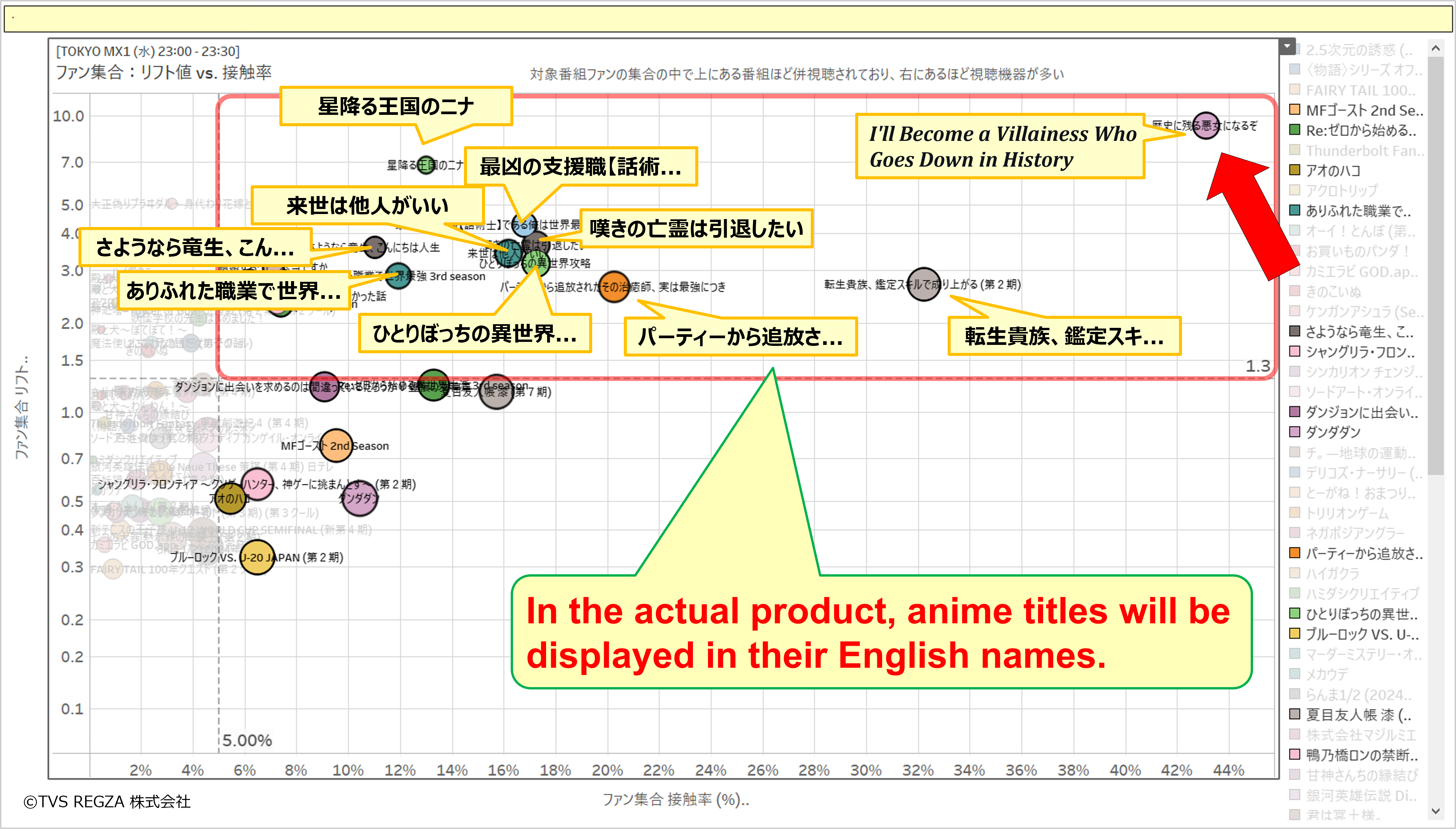
7. Cross-Watching & Viewer Retention
By cross-analyzing groups of viewers who thoroughly watched certain series, it is possible to identify other shows that were heavily co-viewed, as well as track continued viewing on specific devices.
Key Features of the Package (focus: adult-oriented anime)
1. Comparability
Unlike streaming-exclusive shows, this data aligns major anime series side-by-side for apples-to-apples comparisons.
2. Precision Viewing Data
Instead of memory-based online surveys, this provides precise viewing data measured in seconds.
3. Multi-Source Viewing Modes
Real-time viewing, playback of recordings, and timer recording can all be compared and analyzed from a single data source.
4. Demographic Reception Analysis
Viewer acceptance can be compared by gender and age group (Teen, M1, M2, M3, F1, F2, F3*, and region-wide data).
*M = Male, F = Female, 1 = age 20 to 34, 2 = age 35 to 49, 3 = age 50 to 74
5. Episode-Level Trends
Fluctuations by episode (broadcast slot) and the exclusion of numerical drops caused by special programs or recap episodes are implemented, making it possible to compare the true strength of each series.
6. Large Sample Size in Kanto Region
Approximately 670,000 samples from the Kanto region (Tokyo, Kanagawa, and Saitama, including TOKYO MX coverage) enable not only tracking viewership trends per episode, but also analysis and comparison of viewers who watched a whole cour.
*Viewers who watched at least 70% of episodes (e.g., 9 out of 12 episodes) are counted.
7. Cross-Watching & Viewer Retention
By cross-analyzing groups of viewers who thoroughly watched certain series, it is possible to identify other shows that were heavily co-viewed, as well as track continued viewing on specific devices.